Why Good UX is Invisible

We often associate good design with how it looks —beautiful color choices, typography, clean lines, and trendy UI styles. And while that’s not wrong, it’s only one part of what makes a design truly good. The deeper I get into my career as a designer, the more I believe that the best user experiences don’t draw attention to themselves. They just work —quietly, intuitively, and respectfully.
This is what people mean when they say “Good UX is invisible.”
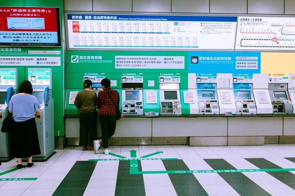
Japan: A Masterclass in Everyday UX
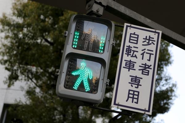
A “beep-boop” sound signifies east-west crossings, while a “piyo” sound indicates north-south crossings

Do you know that this small arc-shaped cut on milk cartons is designed to help visually impaired customers to identify pure whole milk?
When people ask me why I chose to work in Japan, my answer is always the same: because Japan offers some of the best user experiences in the world. From color-coded train lines, different directional sounds at pedestrian traffic lights, to food packaging with tear guides, and buses that gently lower to help passengers board —these thoughtful touches are everywhere. They’re so subtle and seamless that most people don’t even notice them. But make no mistake —every one of them is designed with intention and care.
In digital products, we often chase delight through fancy animations or the latest UI trends. But what users really remember is whether your product helped them do what they needed —quickly, clearly, and without frustration. That sense of ease, of not having to think too much, is what makes UX truly “good”.
Simplifying the Flow, Amplifying the Experience
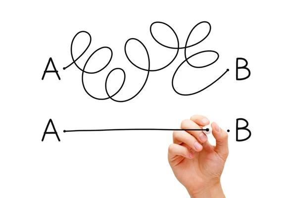
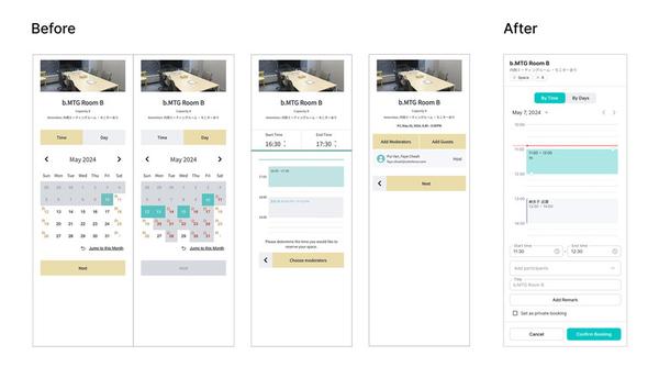
I was reminded of this while redesigning Colorkrew Biz’s booking flow, which originally used a wizard-style interface spread across multiple screens. While it looked clean, users struggled with the experience —they couldn’t see what they had already filled in or what was coming next. Navigating back and forth felt clunky, especially for something as straightforward as booking a meeting room or a seat.
So, I decided to simplify the experience. Instead of keeping the multi-step process, I consolidated it into a single-screen flow, where all inputs are visible at a glance, with just one confirmation button at the end. It reduced clicks and made the process feel more natural. No flashy animations, no drastic UI overhaul —just a smoother, quieter experience that “just works”.
Success Measured in Silence
In Japanese culture, subtlety is an art form. From the refined gestures in customer service to the quiet presence of a well-placed sign. Good UX shares that spirit. It doesn’t scream. It listens, adapts, and quietly supports.
When a design is truly successful, it doesn’t need praise. It simply works, helping users to achieve their goal without a second thought. This is how we should measure success —not by how many compliments we get, but by how seamlessly we integrate into the user’s life.
So the next time your design goes unnoticed? Take it as a compliment.